Mobile Device Access
EXECUTIVE SUMMARY
Architecting enterprise healthcare authentication workflows to eliminate clinician friction, uphold HIPAA compliance, and accelerate clinical access at the point of care.
Key Impact Metrics
Zero-Friction Clinical Workflows Streamlined identity verification and self-service password reset, significantly reducing lost clinical time and helpdesk overhead.
100% Security & Regulatory Compliance Designed multi-factor authentication (MFA) and single sign-on (SSO) mobile flows meeting strict healthcare security standards without compromising speed.
Cross-Platform Adoption Established a unified iOS/Android mobile authentication pattern, scaling identity access across diverse hospital hardware and BYOD environments.
PROJECT OVERVIEW
Timeline: July 2016 - June 2018
Team: Product Manager, Team Lead, External Team (print management group).
End-to-End Product Ownership Owned the complete design lifecycle for OneSign Mobile—from contextual inquiry in clinical settings to wireframing, interactive prototyping, and production delivery.
Clinical & Technical Stakeholder Alignment Partnered directly with Healthcare IT Directors, Security Officers, and Product Leadership to balance rigorous EHR security constraints with real-world physician workflow demands.
Contextual Field Research & Validation Conducted observational research and usability testing within active clinical environments to map low-friction authentication pathways for doctors and nurses on the go.
Scalable Mobile Architecture Defined core mobile UI patterns and accessibility standards for enterprise authentication, ensuring seamless deployment across varied healthcare IT ecosystems.
My Role: Lead Mobile UX Strategist
STARTING STATE
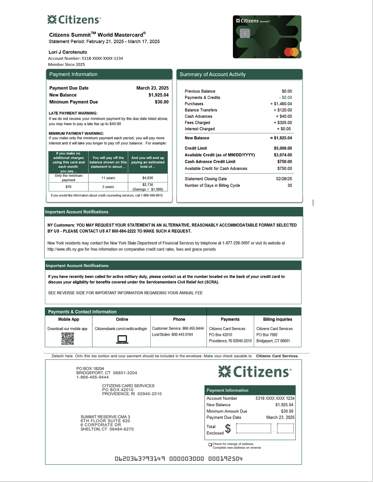
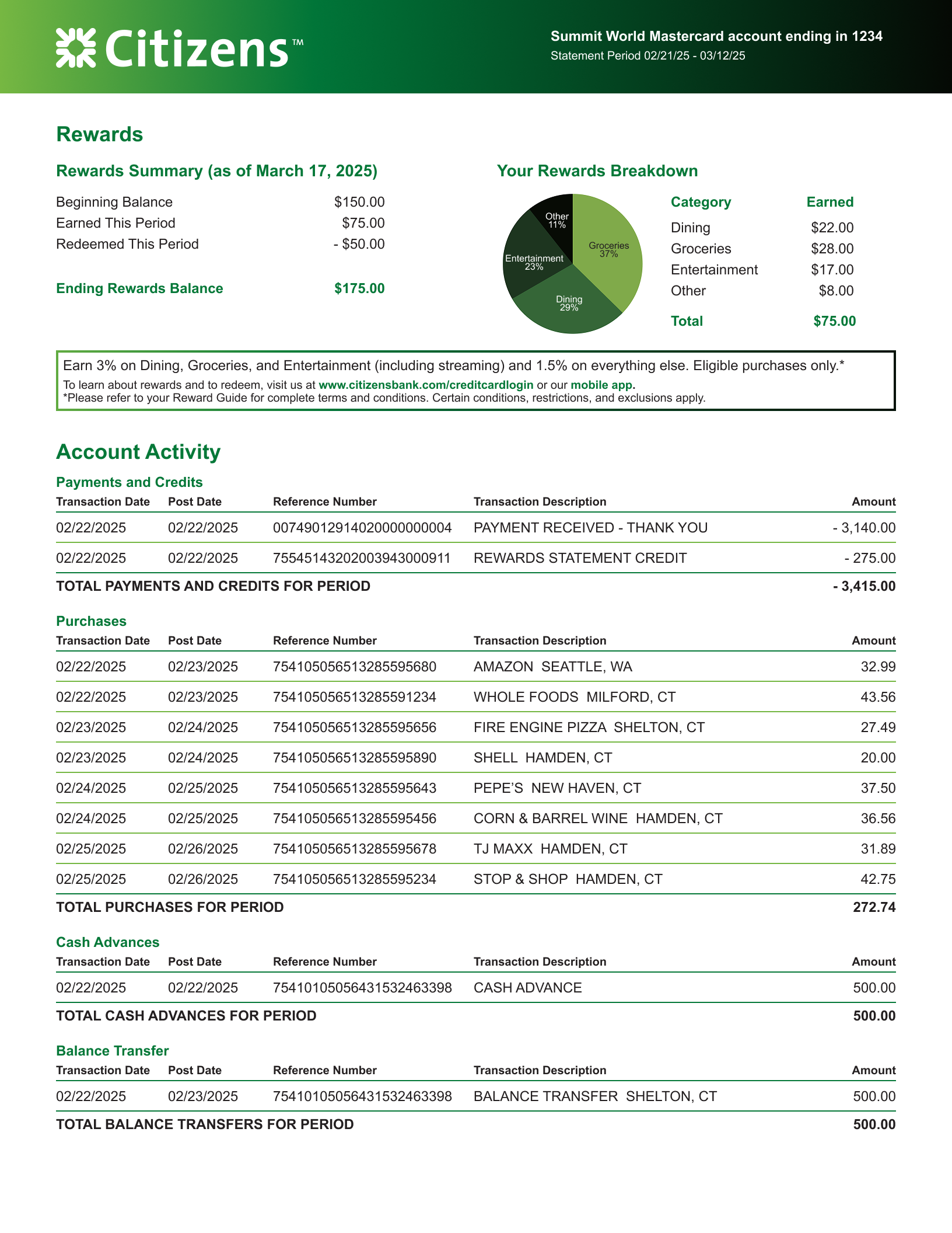
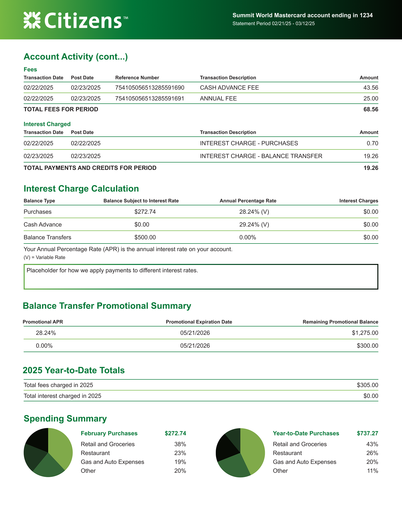
Our current paper statements have been in circulation for years, and had not been updated since their original release, as the focus of work had been on moving to paperless statements. The layout was not intuitive, the spacing lead to text crowding, the branding didn’t align to the bank, and it was difficult to scan and understand,
THE METHOD
I did some competitor reviews, and ran basic user tests to understand what was in the market and what information made sense to the standard user. I also ran an internal test with our product team to better understand what information the business wanted to provide to the user, as well as what updates to the statements needed to be included in our updates.
I also partnered with our brand team, in particular the print team, to understand our marketing materials for the new credit cards and how we could align the statements with our marketing campaign
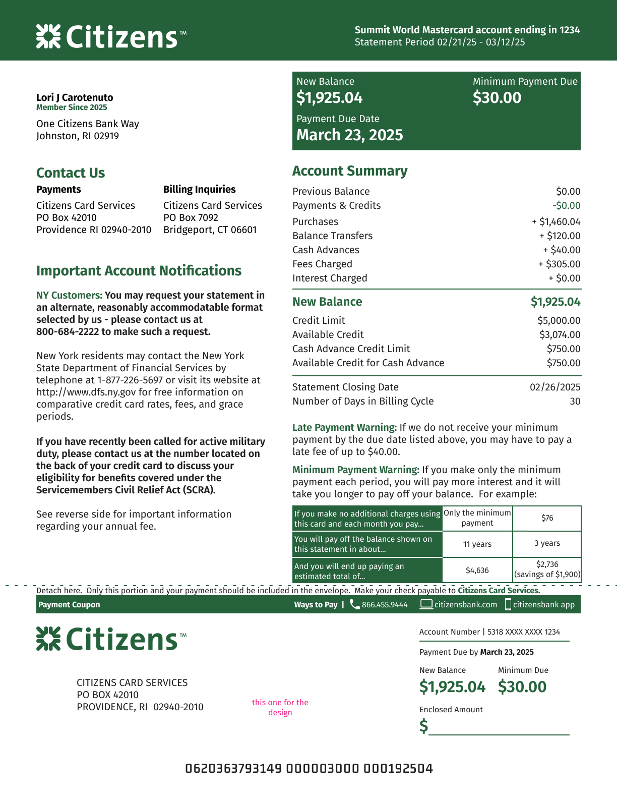
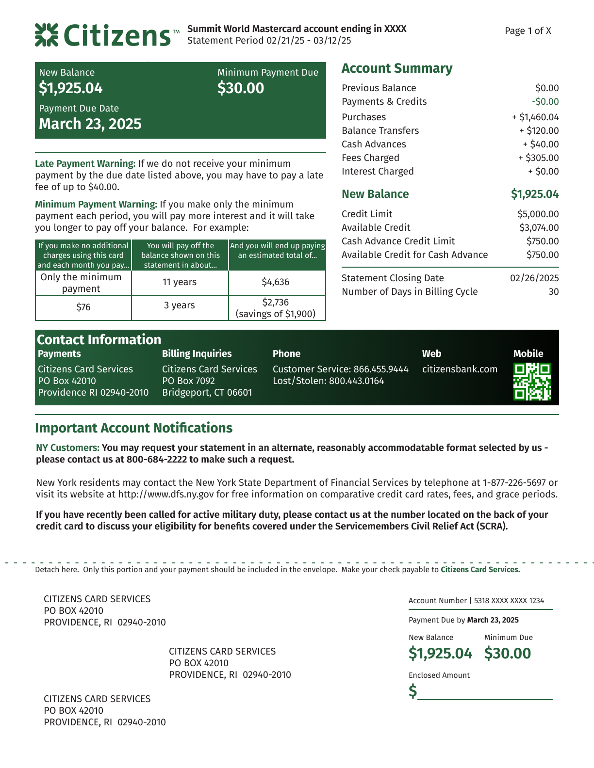
THE SOULTION
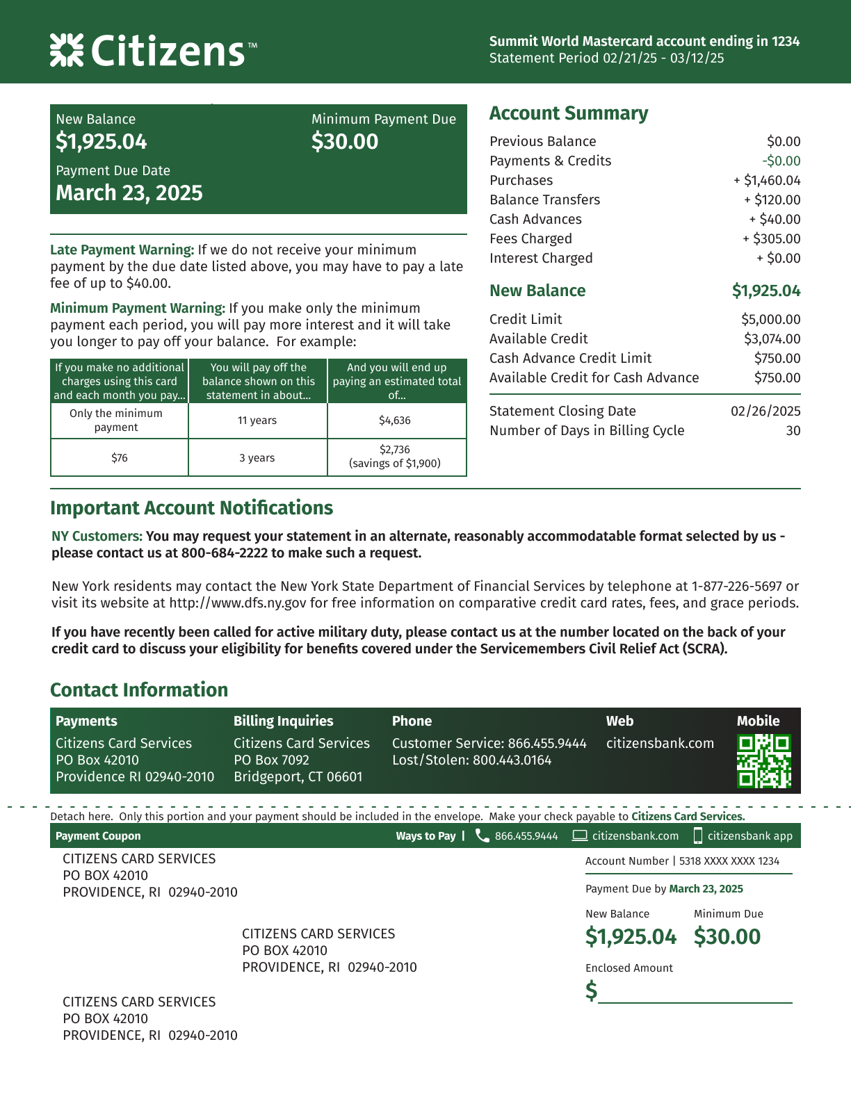
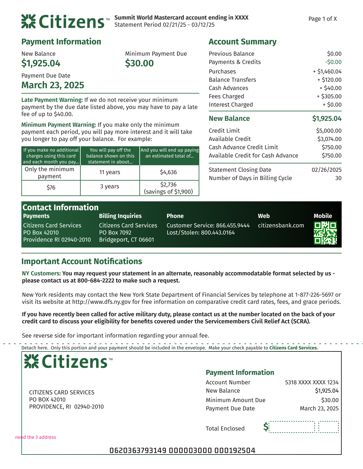
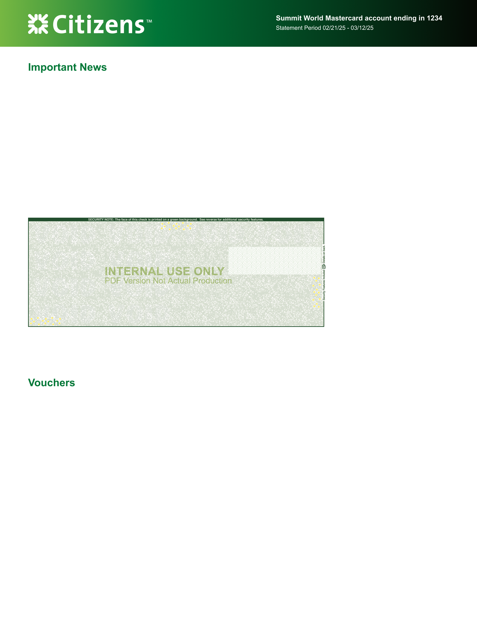
From the explorations we landed on a basic presentation that made sense to our users and the business and worked with my brand team to ensure the colors and styling mapped to our marketing campaign. The original design (and fallback if print had problems) was the flat Citizens Green color, but the gradient was a request that I implemented that caused the page to pop, and allowed us to use one standard for all of our retail bank cards at the same time
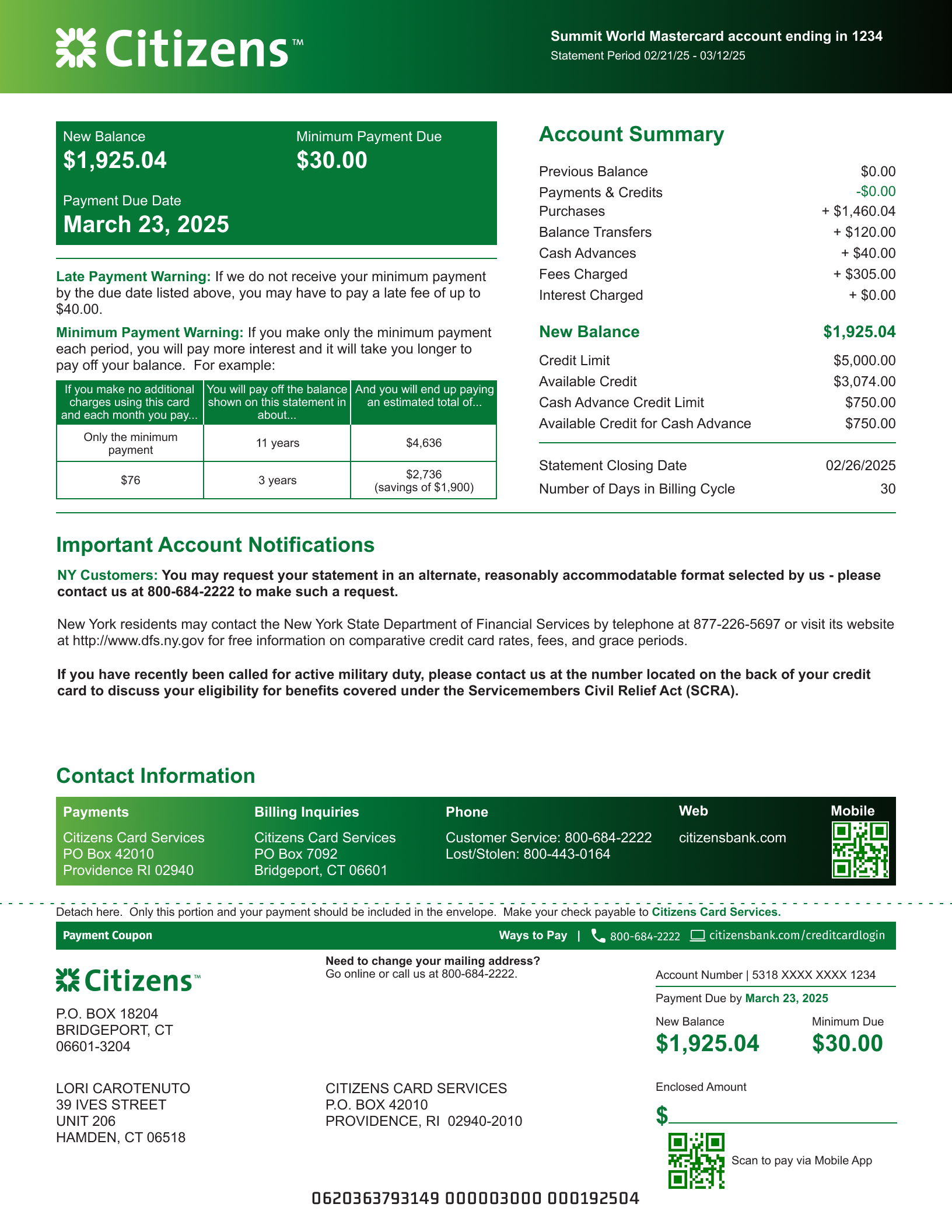
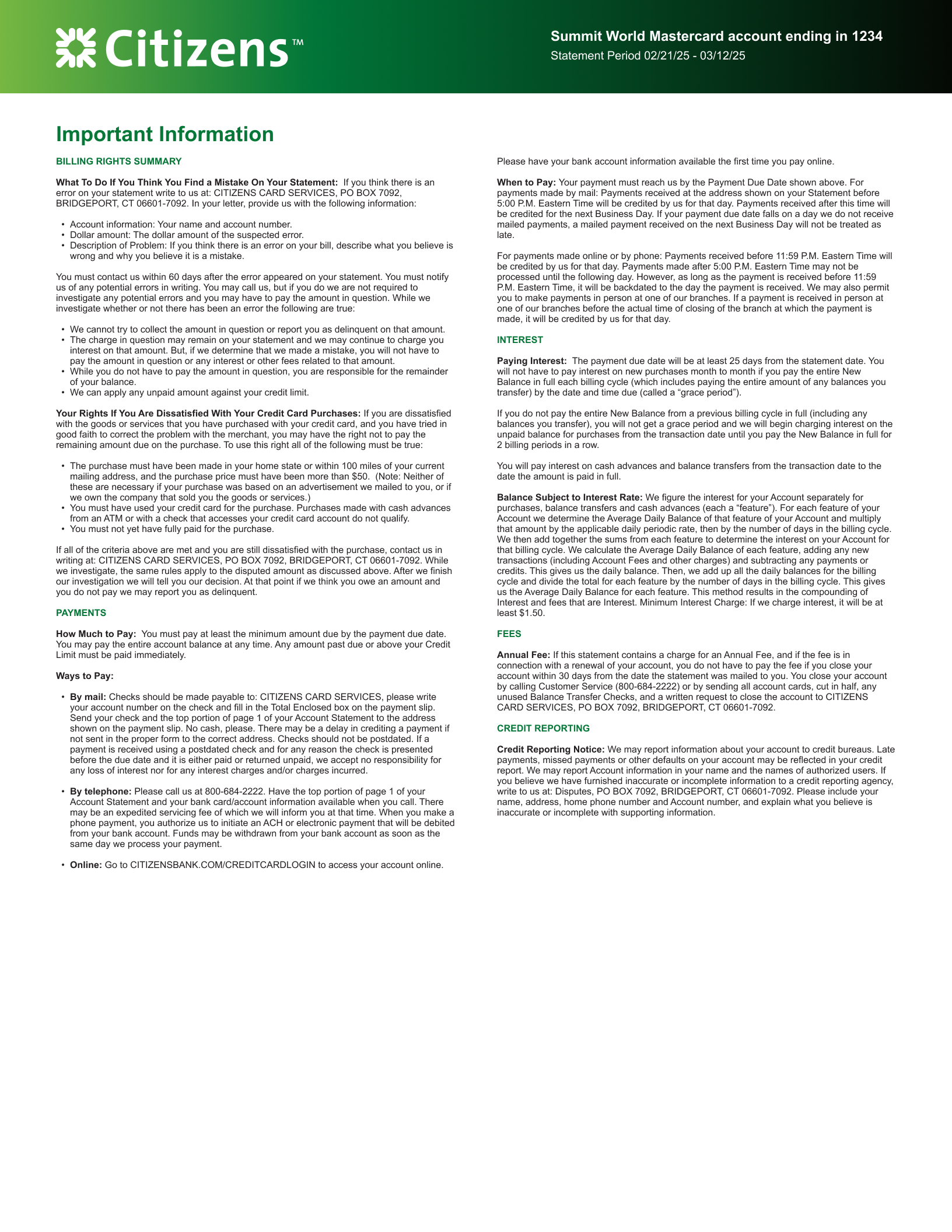
THE FOLLOW-UP
The new statement will be in the mail for our customers at the end of Q2 2026. The last month has been tweaking the mocks and CMYK colors to work best with our printer contractors, and clean up some of the overspray that has been occurring during test prints.
Project Name
Previous
Project Name
Next