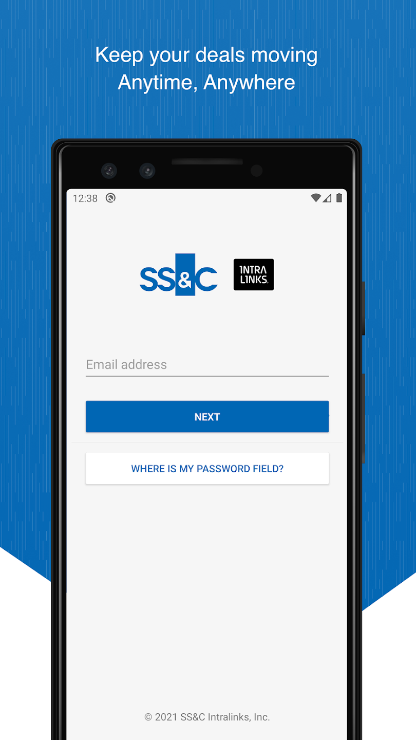
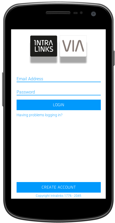
Intralinks VIA®
BACKGROUND
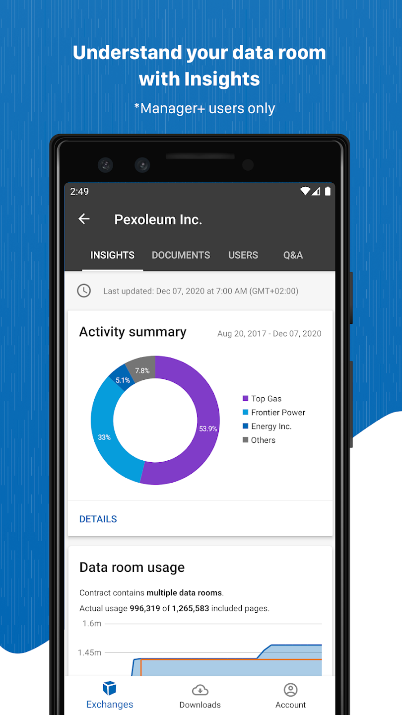
Intralinks VIA was the new, web-based product from Intralinks, that allowed our clients to create large-scale content repositories and case management, along with document-centered workflows and content creation and editing.
With the release of the VIA platform, there was very little attention paid to the mobile experience, until management began hearing back from customers that the need for access on phone and tablet would be a need for people in the field.
THE CHALLENGE
I was tasked to create the proof-of-concept (release 1) and general availability (release 2) design of both the Android and iOS applications. Due to the fact that release 1 needed to be designed in a very short time frame of 3 weeks, I took the focus on the Android design and lead a team of new hires to build the design of the iOS application.
THE OUTCOME
VIA was the first mobile platform and the first of the redesign of the company priorities, which lead the push into various forms of secure file-sharing while on-the-go. It is the foundation of the rest of the applications that were built.
400+ million
documents uploaded
6.6+ million
users on the platform
64 thousand
downloads
PROOF OF CONCEPT
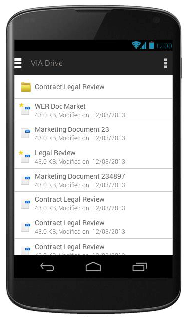
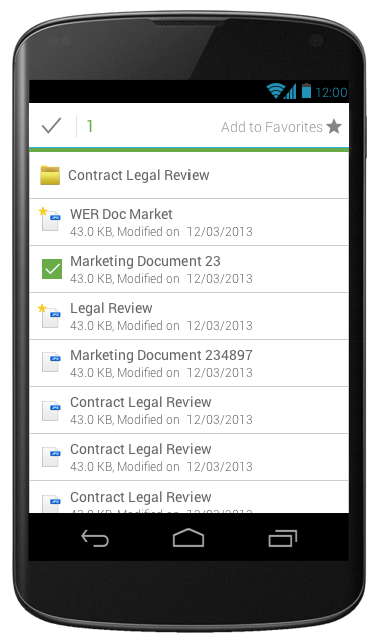
The Engineering and PM leads wrote generic user stories detailing the workflows that had been determined to be ported from web to mobile.
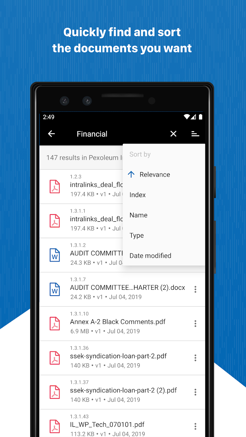
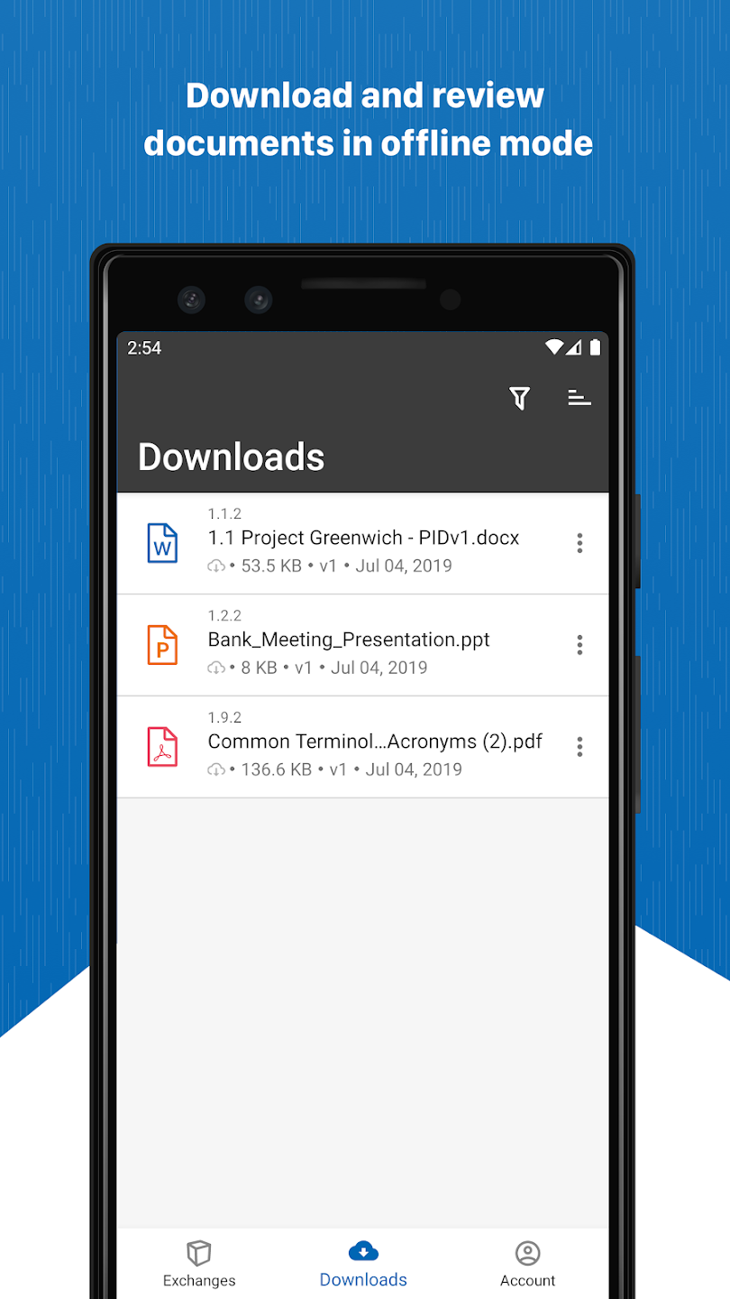
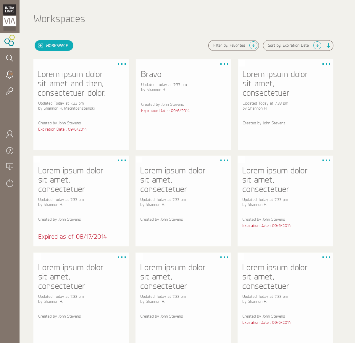
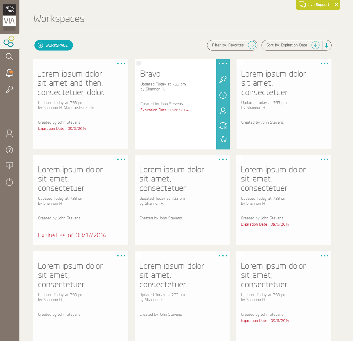
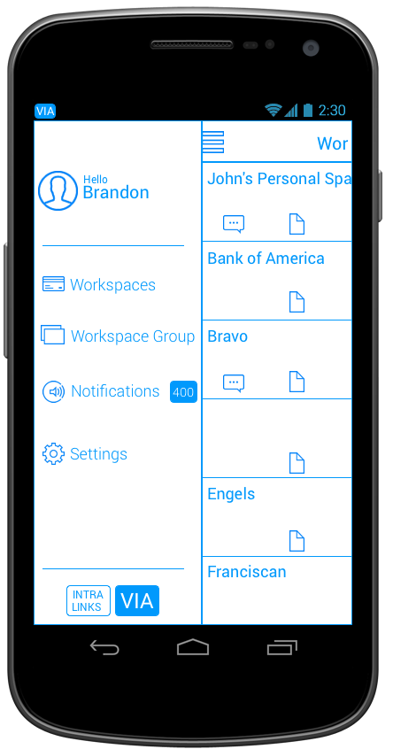
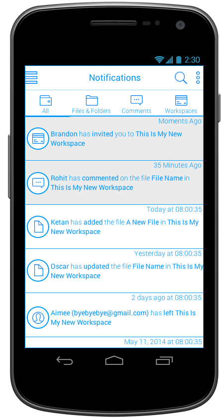
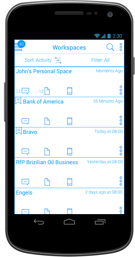
I picked up the project from there, understanding the workflows that would be presented in a mobile experience, and ensuring the needs of our users would be met. From these workflows, screens were built out leveraging the design style of the company and the details from the Android Developer design guidelines.
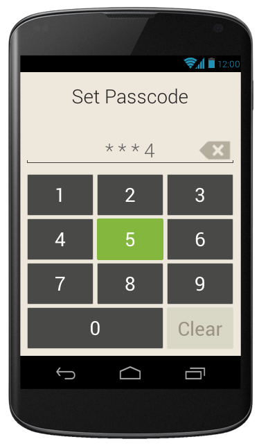
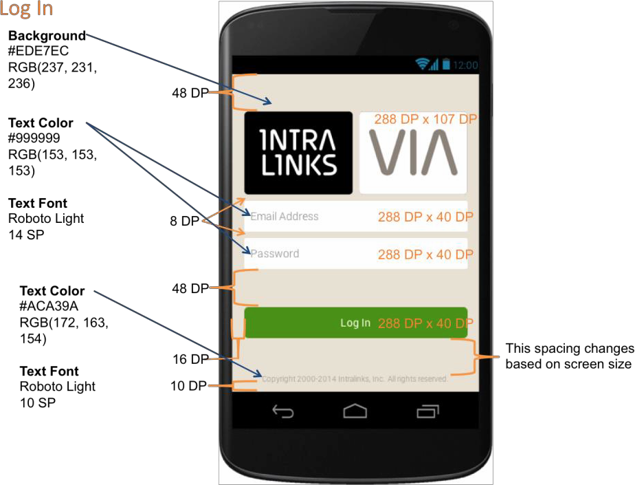
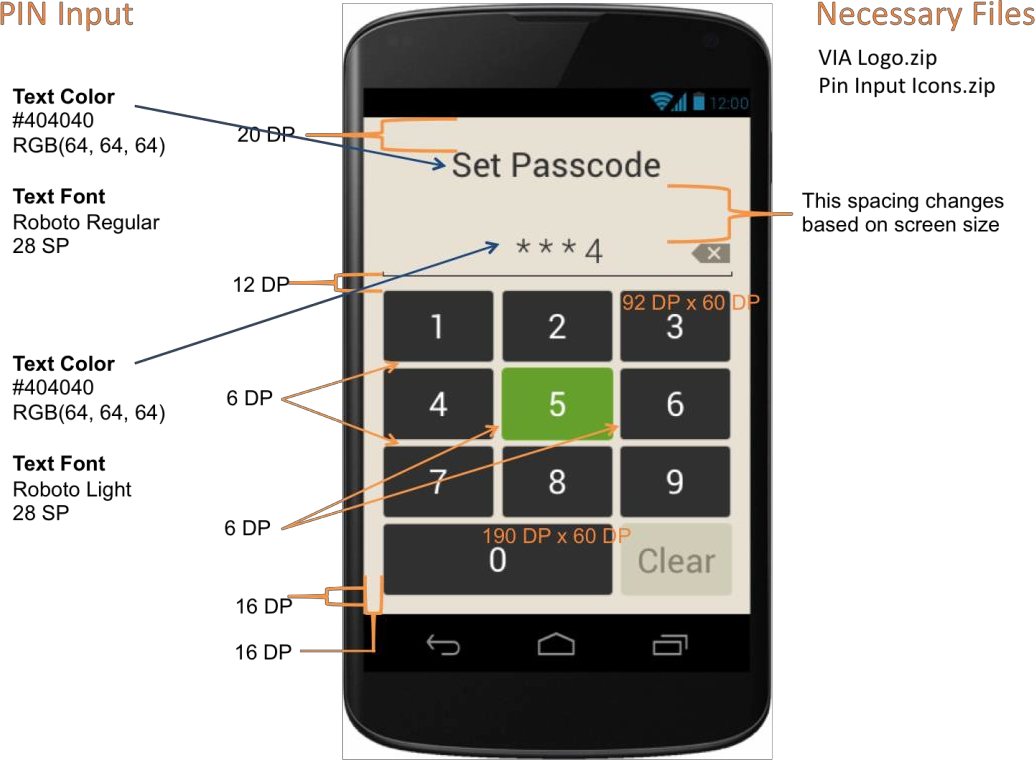
The team that was dedicated to building this was offsite, and the company had not yet created a design system, so a lot of the work had to be spec'd out screen by screen to ensure our team could build the screens correctly.
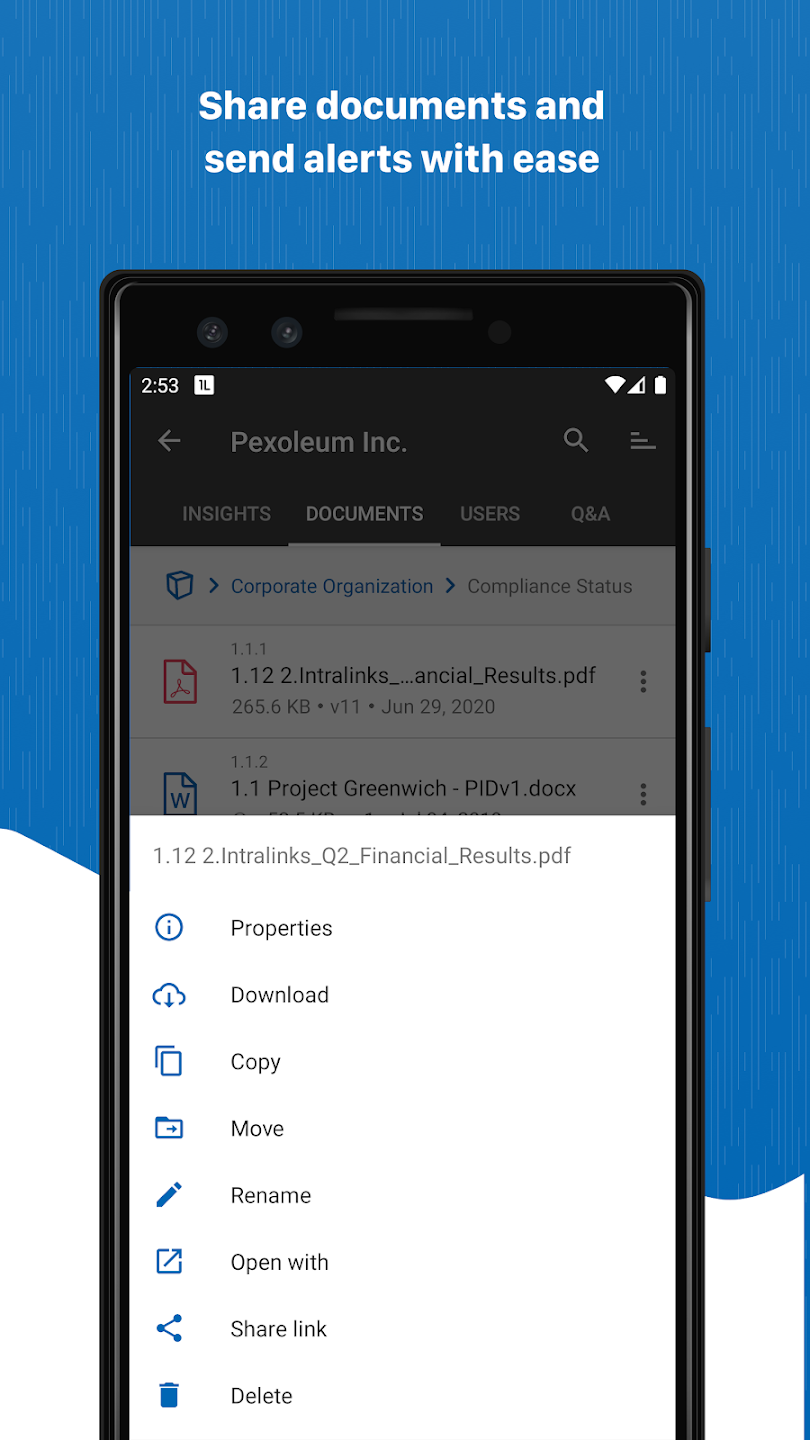
Each icon and image for the application had to be created as a one-off to scale (mdpi - xxhdpi) for the engineering team to integrate into the code base.
GENERAL AVAILABILITY RELEASE
The proof of concept work (release 1) proved successful enough that the product team was given the green light to build the GA release of the VIA application.
Based on the feedback we received from our early adopters was that more of their users were accessing the documents on iPhones and iPads, so my focus was to design around that platform, but make the majority of the design OS agnostic. Interactions (such as swiping left on iOS vs right on Android and how modals and errors were presented) would be where the design diverged.
I started by picking apart the workflows that were integrated in the first version of the application, and documenting both the current flows necessary as well as the flows that needed to be added. It started by meeting with both the internal and external stakeholders to understand the needs.
After understanding the workflows and features that were deemed to be necessary from the interviews, I worked with my engineering leads, and wrote out the user stories for each of the scenarios.
From the created stories, the necessary screens were listed out and I began by sketching out concepts with the other mobile designer to address the needs of each one. These sketches were reviewed by the full product team and company leadership to tailor them down to a few concepts, and then they went through usability testing with a subset of our stakeholders.
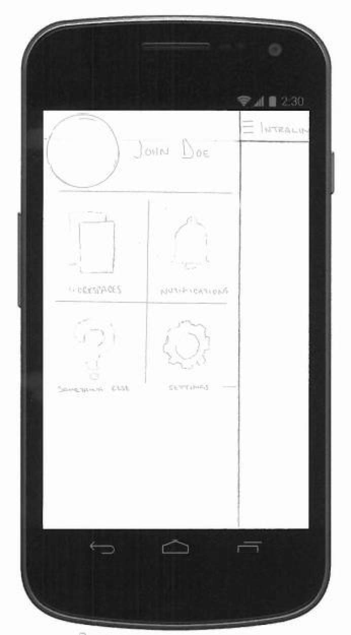
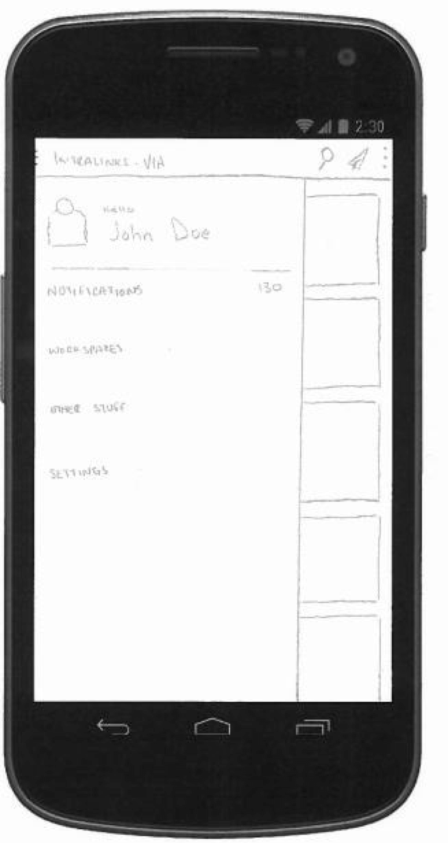
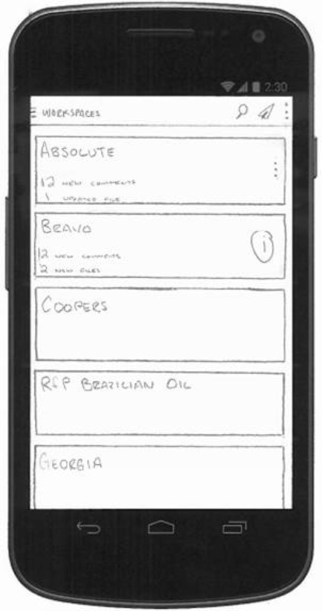
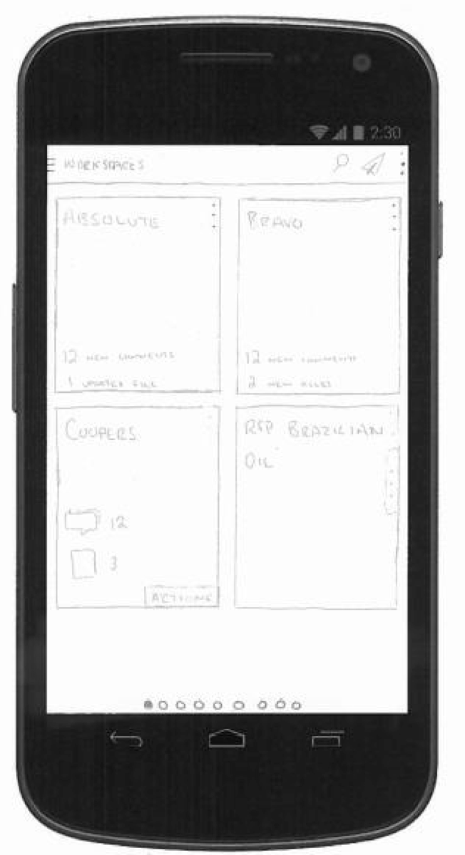
A/B testing with internal and external stakeholders trimmed the designs down to best accepted and lead to the creation of low-res wireframes for each screen in the application. These wires were built in Axure allowing for both screen design and interactions to be built and tested with the same stakeholders that we tested the sketches with.
During the wireframe sessions, I hired a visual designer to help create the style and branding guidelines for our applications. This allowed me to partner with him on some of the wireframes to get an understanding of what assets would need to be created and what patterns and colors we needed to address.
FOLLOW-UP
The App has been available for secure file-sharing since 2014 and continues to follow the design standards I created for it through an acquisition by SS&C and updates to technology (from Jellybean [4.4] through to Cinnamon Bun [17]) .