OneSign Mobile
BACKGROUND
Since 2004, Imprivata has provided single sign-on access to desktop computers through their OneSign software, allowing clinicians and providers to focus on their patients and not fussing with remembering the multitude of user names and passwords for all of their applications.
With hospitals moving away from having workstations-on-wheels to providing their staffs with handheld computers and tablets, there is a need for a similar single sign-on application for these devices. OneSign Mobile is the application to provide the same workflows on tablets and phone-form devices as clinicians expect on their desktops.
THE CHALLENGE
Understand the mobile landscape, both current and future, in medical provider offices and hospital systems. Create platforms that addresses access issues in the mobile space, similar to the solution(s) we have for Windows machines and Virtual Desktops.
THE OUTCOME
Understand the mobile landscape, both current and future, in medical provider offices and hospital systems. Create platforms that addresses access issues in the mobile space, similar to the solution(s) we have for Windows machines and Virtual Desktops.
88%
reduction in device loss
95%
decrease in help-desk tickets
400%
faster device checkout and access
RESEARCH
In order to provide our users base the best application I had to truly understand the different workflows that doctors and nurses could access on mobile devices. When this project began, doctors were bringing their own iPads in as research, and nurses were not using handheld devices at all. A lot of the preliminary research was spent understanding what IT admins and CIOs as the future vision for mobility within (and outside) their walls.
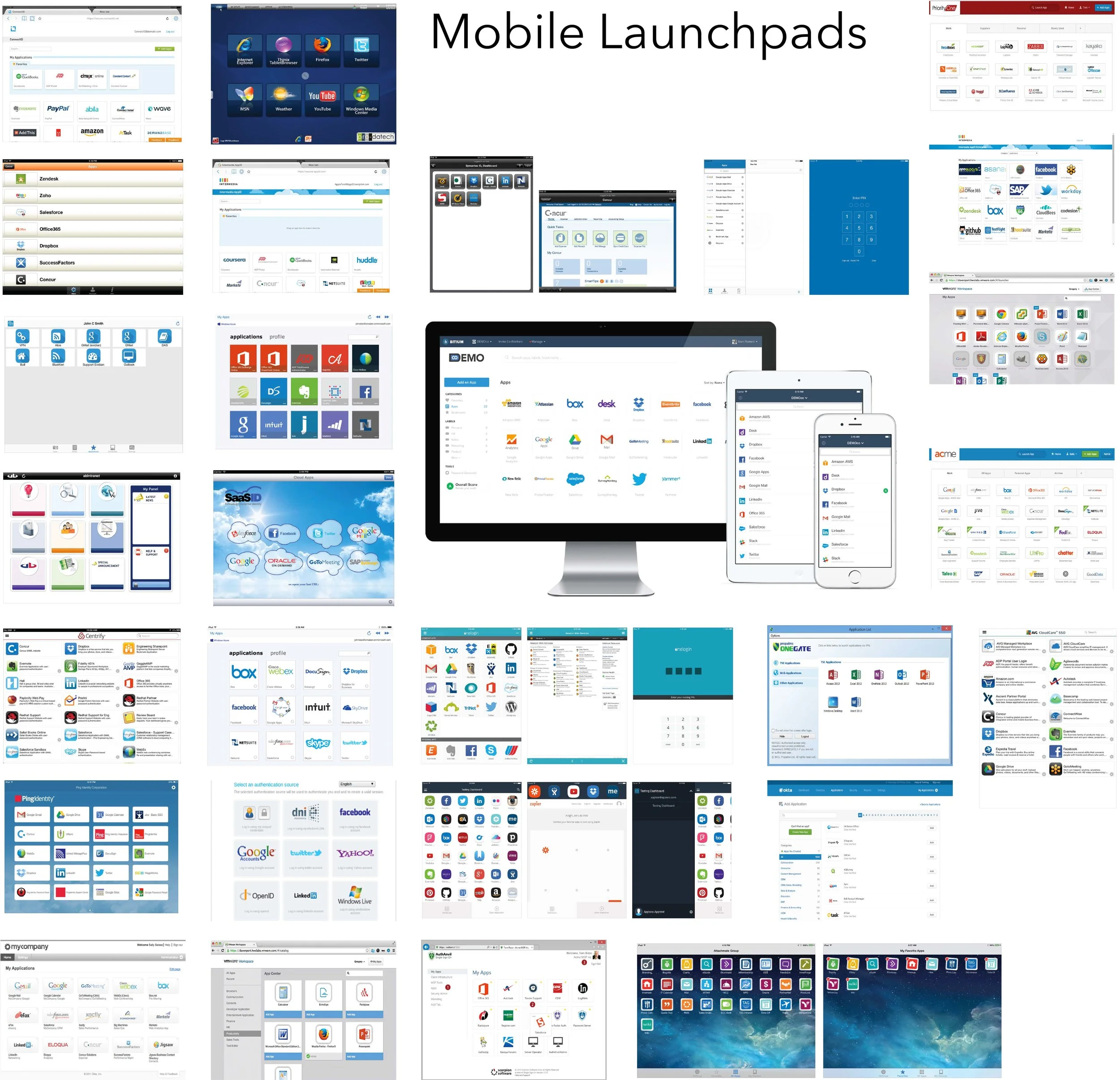
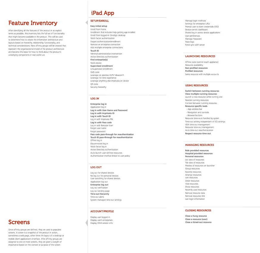
After stakeholder interviews were run, a list of features for the mobile application were created (for tablet and phone). From this exhaustive list, through a smaller review with key stakeholders, the “necessary” features were singled out. Following, a review of the competition was run to understand the landscape we were competing in, and the feature sets already available to the public, which helped tailor our list a bit.
SKECTHING/WIREFRAMING/PROTOTYPING
I ran sketch sessions with a few doctors and nurses from Beta customers, as well as with the UX team and the key internal stakeholders, to create basic workflows and wireframes for the mobile application. From there, I A/B tests (using UserZoom), to make tweaks on the fly and have a basic understanding of how a user would interact.
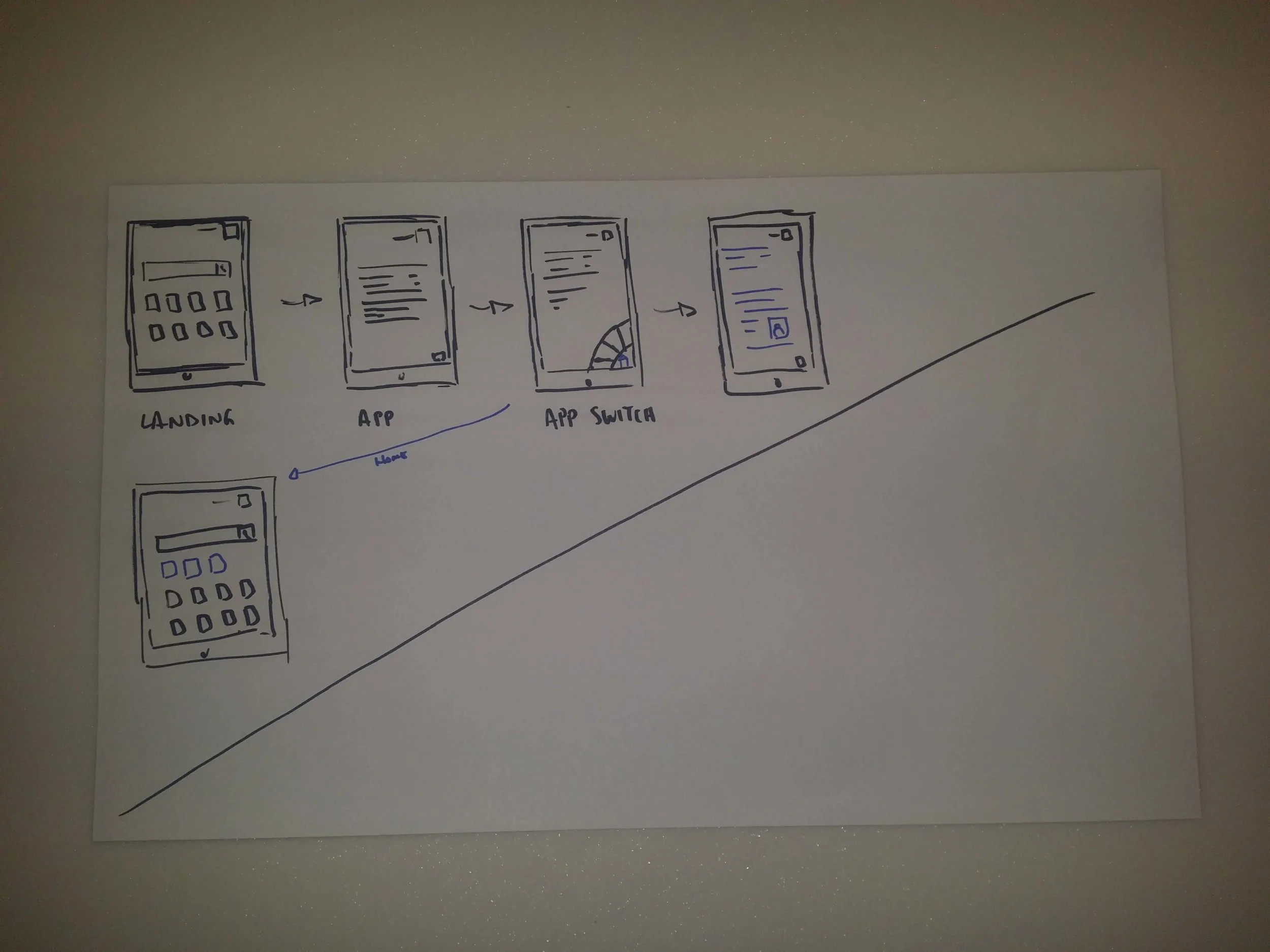
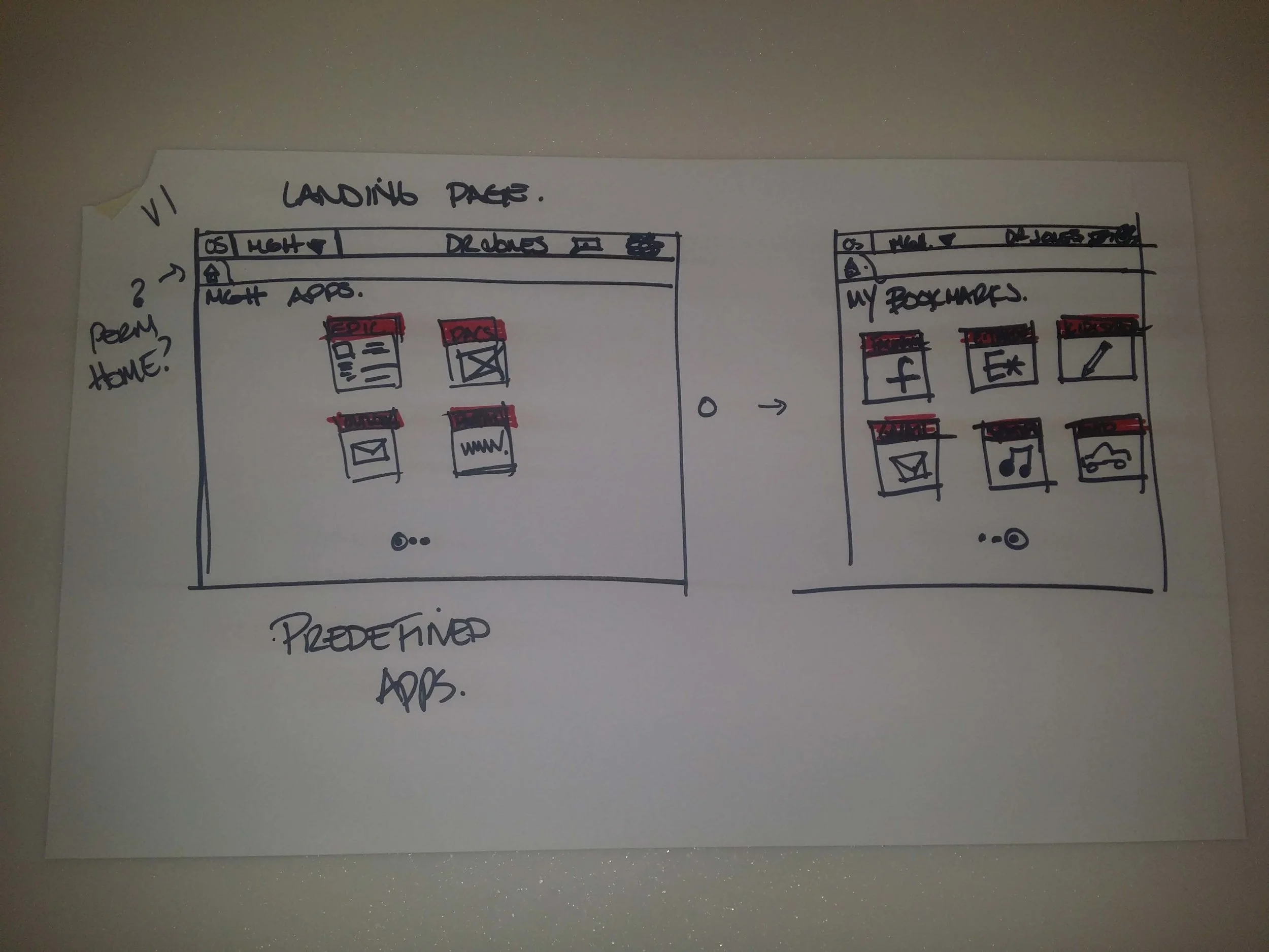
My original concept was to present a similar application to LastPass for iPads that would allow clinicians to access their web apps without having to remember their username and password. After running a design session with the UX team and gathering sketch ideas, I created a quick prototype for our external stakeholders.
THE PIVOT
After reviewing the notes from user testing, and actually getting into hospital environments to understand them better, the big take-away was that, on whole, this would not work in their systems at the time (2016), for technical or funding reasons. So, with that information, there was a pivot to change our direction (and a new PM). Providing web access on our desktops, something we had not realized, was a hole in our current offers (but that's a different project).
The pivot led to some interesting concepts being created, from leveraging custom keyboards on iOS and Android to building out an entire OneSign Android ROM. What we gathered from this free-flowing work was that the biggest need for mobile devices was SSO.
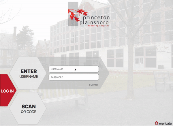
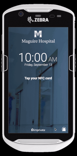
In regards to operating systems, although iOS tends to be to go-to for personal use, there were shortcomings that we could not address in a clinical environment. Android gave us more flexibility on device size/type and allowed us to access their Bluetooth and NFC capabilities for mobile authentication. The dynamic in the clinical environment changed as well, as more and more handheld devices were being designed on an Android platform with NFC unlocked.
NEW DIRECTION
With a focus on the Android operation system and having it work on shared devices (hospital owned, shared between nurses), I had a specific direction to focus on. I began by detailed the necessary features for the client facing application and admin-centered work, based on the current design patterns and understanding which patterns would need to be created.
For our Alpha design, knowing that the key stakeholders would be doctors and nurses, I created a rough prototype for the devices that leveraged a generic Android pattern I had running on my personal device.
For the Beta version of the application, my PM and I decided that the focus would be on client application, with the access details being created with the early adopting healthcare systems and our Business Development group. Knowing the means of access that we had tested and confirmed on the devices, I sketched out a card UI concept mirroring our desktop brand guidelines.
These sketches were reviewed with the lead visual designer as well as with my engineering team to get approval. With everyone on the same page, I built the visual design out for my team to work on.
FOLLOW-UP
My application went live in 2018 and has been updated over the last 8 years to expand into other experience outside of the hospital system.