Credit Card Statement
EXECUTIVE SUMMARY
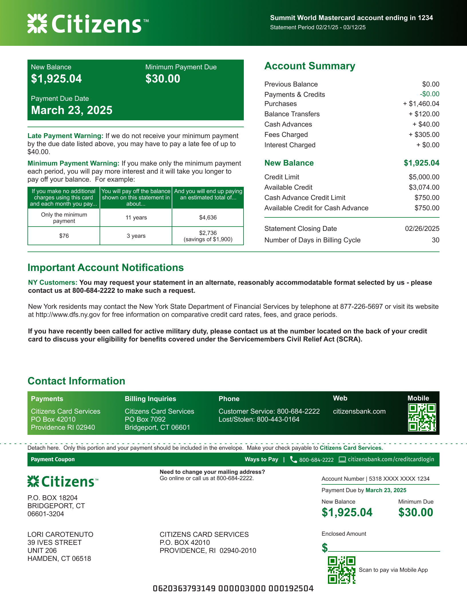
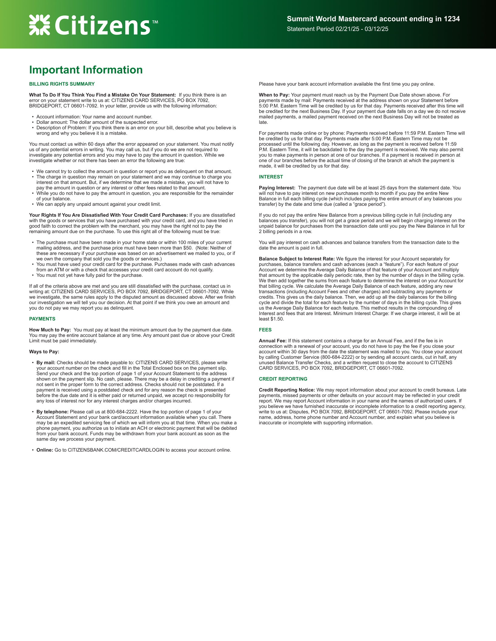
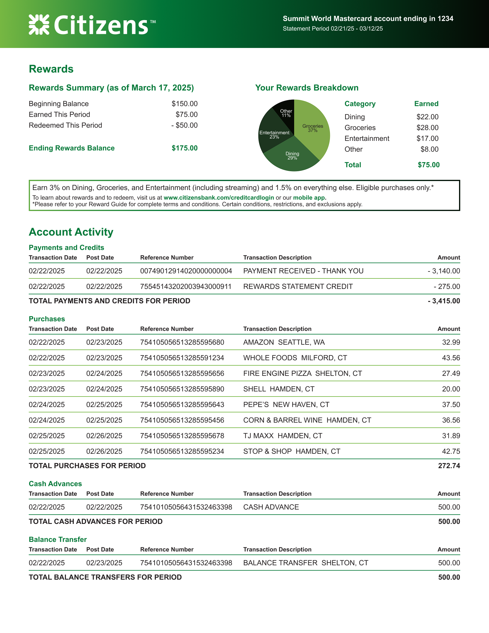
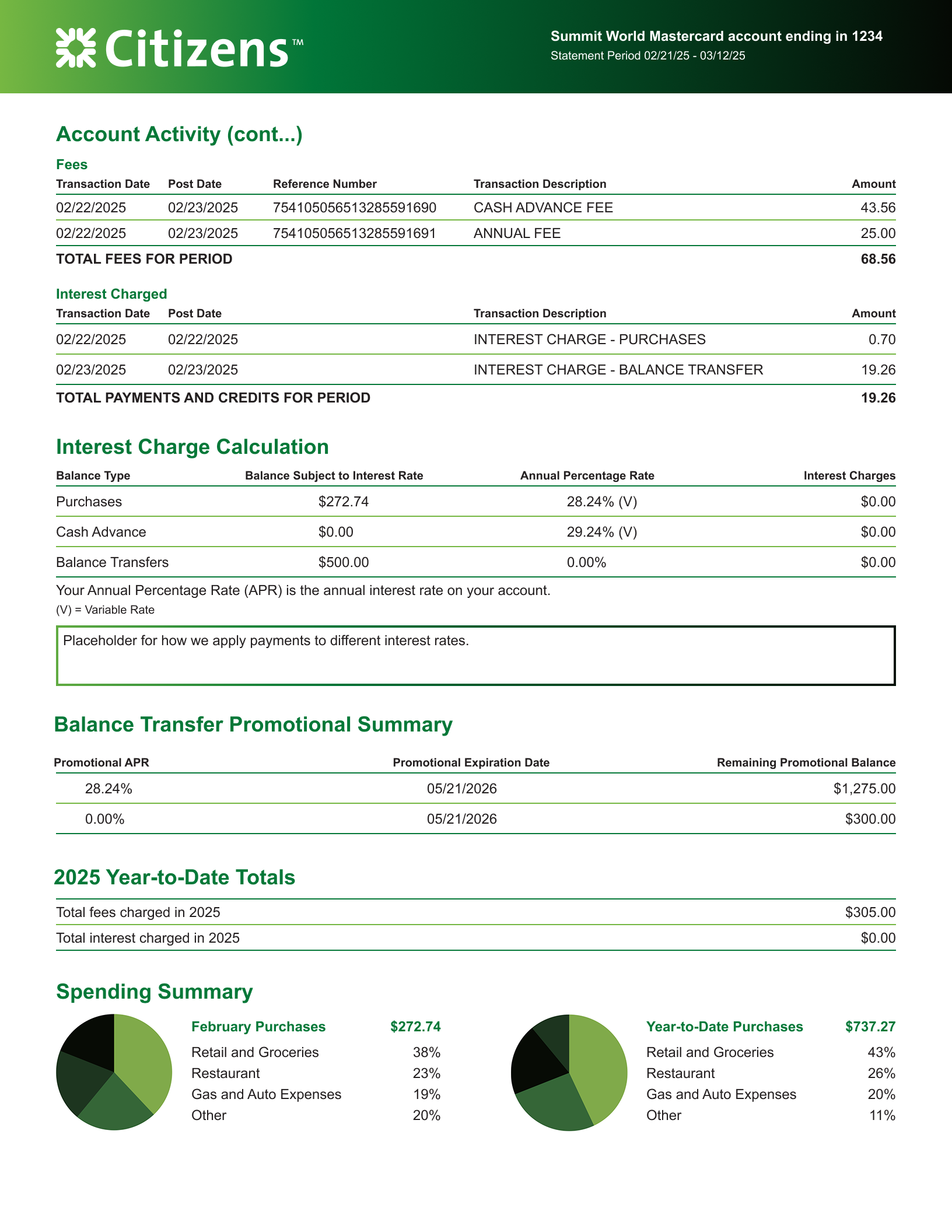
Updating our Credit Card statements to align with new brand standards, drive operational efficiency across retail banking products, and improve financial clarity and accessibility for customers.
Key Impact Metrics
1 Multi-Brand Standard Consolidated disparate statement templates into a single, scalable design framework for all retail bank cards.
100% WCAG AA Compliant Redesigned layout hierarchy, contrast, and typography to meet rigorous accessibility and readability standards in print.
Vendor & Production Alignment Eliminated print overspray and template variations through close collaboration with print production partners.
PROJECT OVERVIEW
Timeline August 2025 - December 2025
Team Product Manager, Team Lead, External Team (print management group).
My Role Lead Experience & Design System Strategist
Cross-Functional & Vendor Facilitation Partnered with Product Managers, CX leads, and external print vendor teams to translate digital brand tokens into high-yield, production-ready CMYK print specifications.
Scalable Design Governance Established the design language and layout framework for physical statement communications across the retail banking portfolio, ensuring long-term consistency and lowering maintenance overhead.
Design Trade-off & Risk Management Navigated technical print constraints—such as ink overspray and paper feed tolerances—by making strategic, data-informed adjustments to gradients and spatial layouts without compromising brand integrity or compliance.
User & Stakeholder Alignment Led research sessions with internal product groups and external cardholders to align business priorities (promotional features, regulatory disclosures) with user needs (scanability, payment clarity).
STARTING STATE
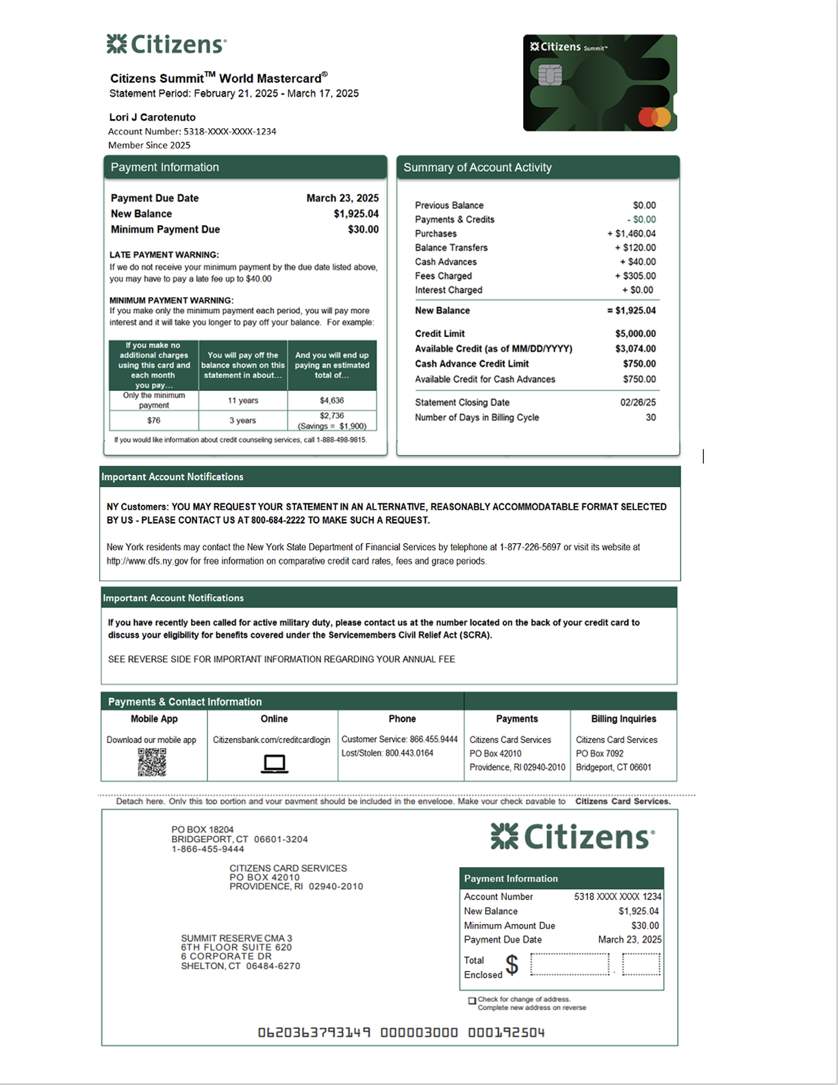
Our current paper statements have been in circulation for years, and had not been updated since their original release, as the focus of work had been on moving to paperless statements. The layout was not intuitive, the spacing lead to text crowding, the branding didn’t align to the bank, and it was difficult to scan and understand,
THE METHOD
I did some competitor reviews, and ran basic user tests to understand what was in the market and what information made sense to the standard user. I also ran an internal test with our product team to better understand what information the business wanted to provide to the user, as well as what updates to the statements needed to be included in our updates.
I also partnered with our brand team, in particular the print team, to understand our marketing materials for the new credit cards and how we could align the statements with our marketing campaign
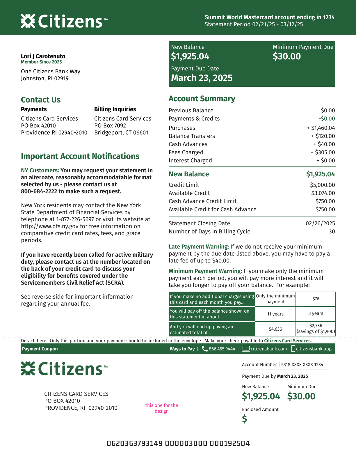
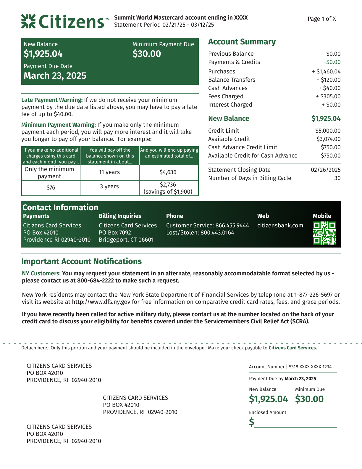
THE SOULTION
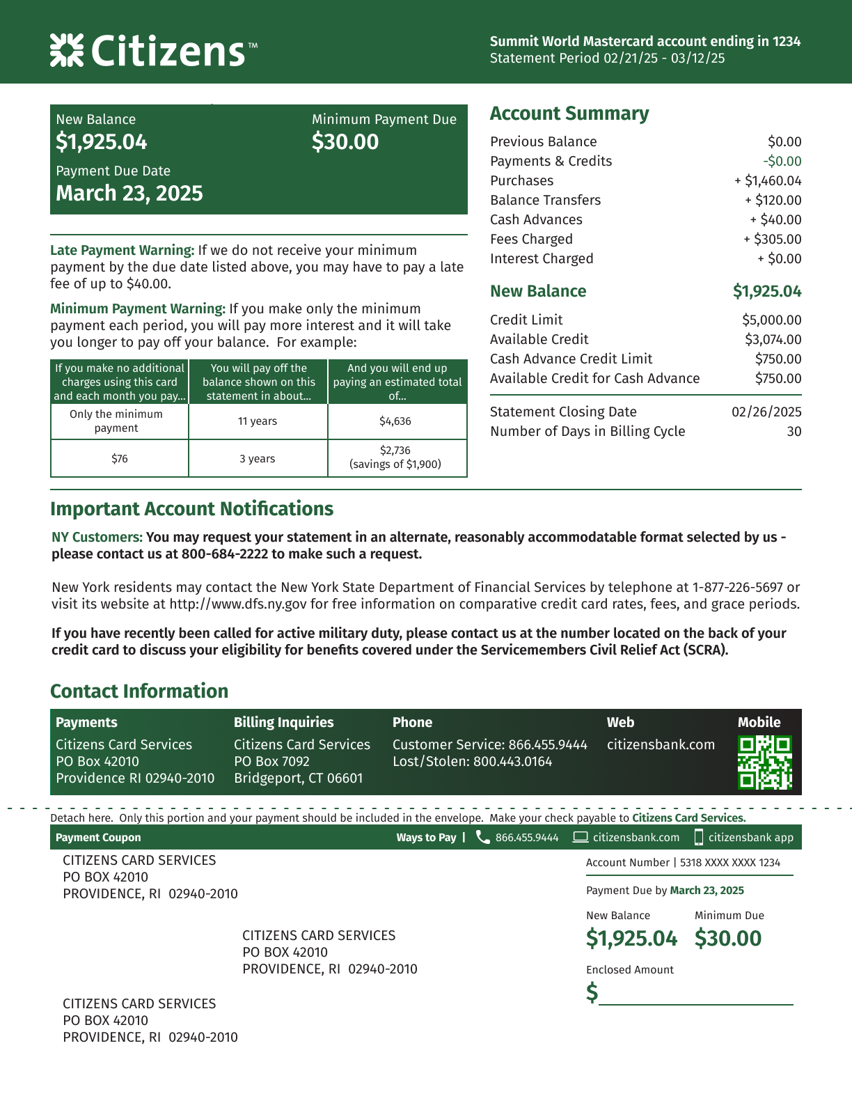
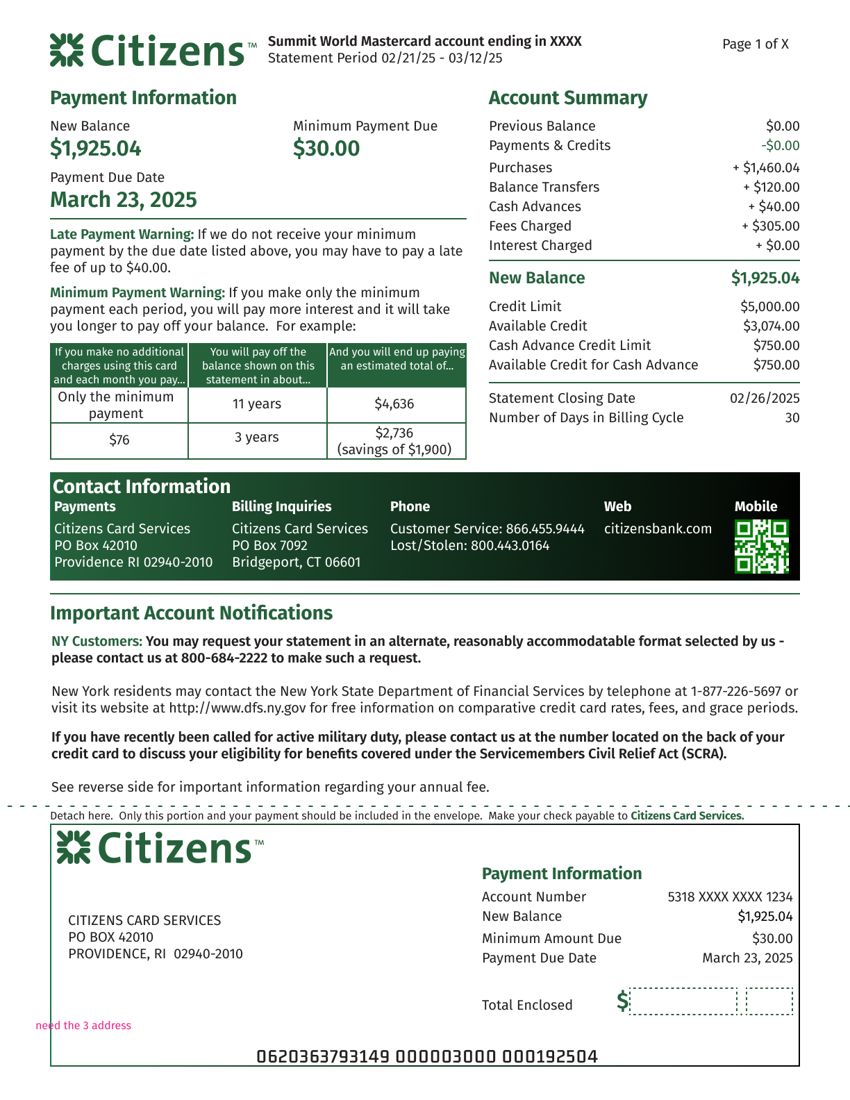
The gradient treatment was the design decision that made the new statement stand out — it gave the page visual energy the flat green original never had, and it let us unify the look across every card in the retail portfolio under one standard. But once we moved from digital mockups into physical test prints, our print vendor flagged a real risk: at scale, the gradient was prone to overspray, which could compromise legibility and brand consistency on a document customers rely on for financial accuracy.
Rather than defaulting back to flat color and losing the visual differentiation we'd built the whole redesign around, I treated it as a production problem to solve rather than a design decision to abandon. I worked directly with the print team through a series of test runs, adjusting the gradient's spatial parameters and ink transitions until we found a spec that held up reliably within their CMYK tolerances. In parallel, I kept the original flat Citizens Green as a documented fallback — so if a particular print run or paper stock couldn't support the gradient, the design could degrade gracefully without a mid-project scramble.
That combination — solving for the ideal outcome while keeping a proven fallback in reserve — meant we shipped the more distinctive design without betting the whole timeline on it working perfectly the first time.